I was lucky enough to receive a 13” MacBook Pro with Retina display for work a few months back.
It’s a beautiful device. At first I didn’t think it would make a big difference but after using for a day it’s hard to go back to other displays. It’s like the transition from VHS to DVD or SD to HD.
The first website I designed while having the Retina display was Runnable.com and of course I was now more inclined to design for high-resolution screens as I notice the results on a daily basis.
Below are just a few techniques I learned while designing for high-res devices.
1. Use media queries for high-res CSS styles
Using CSS media queries you can target any device with a high-resolution screen and provide it with alternate styles.
It’s very straight forward, and some what similar to providing responsive or alternate mobile styles.
@media only screen and (-webkit-min-device-pixel-ratio: 2),(min-resolution: 192dpi) {
  /* High-res styles go here */
}
This should be enough, but if you want to target other highish-res screens, you can read up on Chris Coyier’s Retina Display Media Query post here.
2. Have two versions of your CSS sprites: standard dimensions and @2x
Maykel Loomans wrote a very useful post last year on using CSS Sprites to optimize your website for Retina displays.
Loomans recommends having two sprite files, one for standard and one for high-res.
![]()
Using the media query I shared above, simply change the background image reference and then resize the background image.
@media only screen and (-webkit-min-device-pixel-ratio: 2),(min-resolution: 192dpi) {
  .logo{
    background-image:url(assets/[email protected]);
    background-size:500px 500px; /* This replicates the original standard sprite dimensions, and assumes the actual dimensions of [email protected] are 1000x1000px */
  }
}
3. Serve up larger html embedded images with Javascript
The sprite solution above is only good for assets referenced in your CSS. But what about images on your page?
Imulus developed a useful plugin Retina.js that solves this for you.
The script will check your server to see if you have any image source with @2x at the end.
For example:
<img src="/images/my_image.png" />Retina.js will look for:
"/images/[email protected]"See their documentation on how to implement.
4. More detail doesn't necessarily mean more data
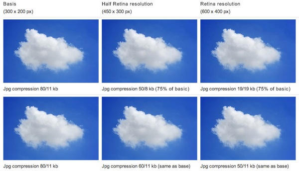
Daan Jobsis conducted a very interesting experiment last year looking at pixel quality, image dimensions and compression.
More pixels = better display. But, more pixels doesn’t necessarily have to mean 4 or 5 times more data. More detail can be accomplished with less kilobytes.
The bottomline is that heavy compression doesn’t affect the final image as much as you would expect. This is because of the greater amount of pixels in the Retina image, compression artefacts are scaled down and therefore almost unnoticeable.

Basically an image can have larger dimensions, but can also be compressed more and you still get great results on a high-res screen.
You can see various image dimensions, file size and quality comparisons in Daan’s follow up post here.
5. You can just use the same image assets for both standard and high-res screens
I’ve talked above about how to serve up alternate assets for high-res screens. The downside of this is having to maintain two versions of graphical assets and images.
Turns out you can use the same assets.
For example, with CSS sprites you can use the @2x version for all users, and let your CSS do the resizing for all users. Or every embedded image can have larger dimensions than needed, and then you explicitly set the width of that image.
The pros of this are that you maintain one version.
The cons, depending on how you compress the assets, your users may have to download larger files than they actually need.
Bonus: Don't forget your Retina-ready favicon
Nothing is more telling whether a website has invested in support for high-res screens than your favicon. And it’s a very simple fix.
Ensure your favicon is 32x32px and you’re golden.
Use iConvert to convert a PNG to ICO.
Conclusion
High-res screens, in particular the MacBook Pro with Retina display, are fantastic and I highly recommend Designers invest in them.
More and more devices have high-res and if you want your product or website to look professional to users of these devices, you should put some thought into how they look.
My preference is to only maintain one version of each graphical asset instead of two (I’m lazy), so I’ll typically have an @2x sprite that I resize for all users. I’ll also try to save highly compressed images in large dimensions for web so they look good when resized in the browser.
Some other, more obvious, techniques that I haven’t mentioned above are making good use of CSS, @font-face, icon fonts and SVG, instead of relying on bitmap images.
Have you any other advice designing for high-resolution?
Receive more design content like this to your inbox
I promise not to spam you. No more than one email per week.