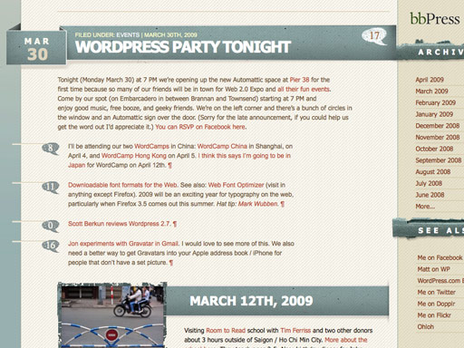
This is a creative trend catching on. It’s very simple to do but adds an extra element of character and uniqueness to a design.
Take a look at how to implement this ‘out of the box’ technique and a list of creative websites that are using it.
Setup
First setup your page and graphic. I’m using this graphic.

The HTML for my page is like so:

And the CSS looks like this:
body{
background:#999999;
}

#container{
width:960px;
background:#fff;
margin:20px auto;
padding:10px;
}
Here’s a preview of what we have so far:

Positioning is relative
When we position the logo we want the positioning to be relative to the container, therefore make the position relative:
#container{
width:960px;
background:#fff;
margin:20px auto;
padding:10px;
position:relative;
}
Position it outside the box
Now all you have to do is position your logo. Place it horizontally so the tag sticks out of the container.
#logo{
position:absolute;
left:-15px;
}
Now we have our logo sitting outside the box. Easy!

15 creative designs using the 'out of the box' technique
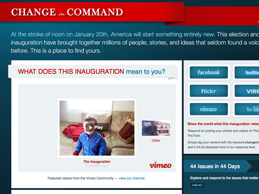
Change in Command
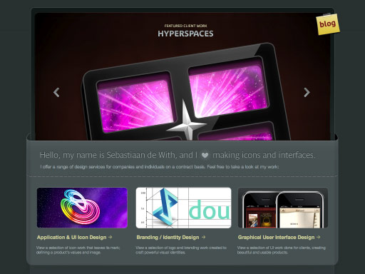
Icon Designer
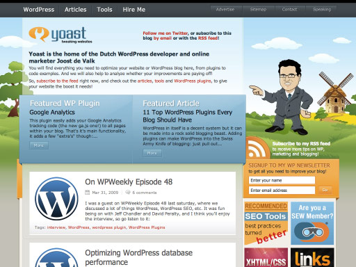
Yoast
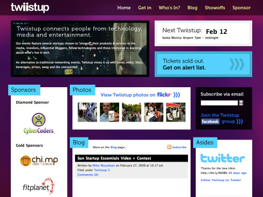
Twiistup
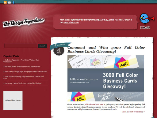
The Design Superhero
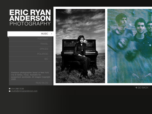
Eric Ryan Anderson
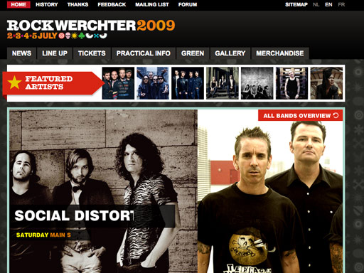
Rock Werchter
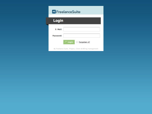
Freelance Suite
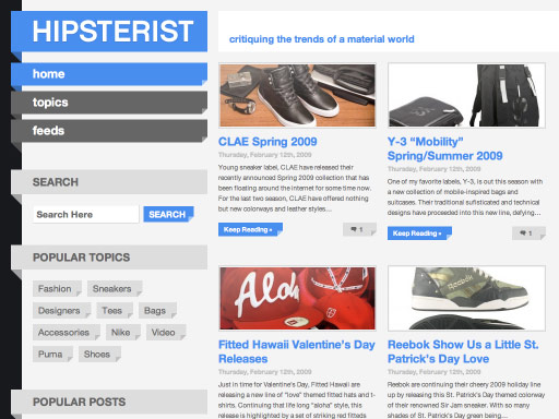
Hipsterist
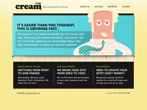
CreamScoop
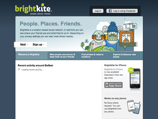
Bright Kite
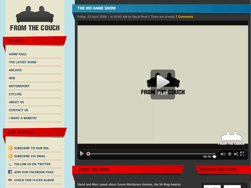
From The Couch
DesignM.ag
Matt Mullenweg
Feel free to share your thoughts on this and other emerging trends.
Receive more design content like this to your inbox
I promise not to spam you. No more than one email per week.
