Different colours mean different things to us and by using colour we can associate feelings and actions to certain situations.
A short story about a safe
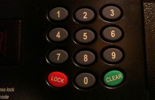
Recently I was staying in a hotel and like most hotels it had a safe in the room. To activate the safe I had to dial in a pin number of my choice and press the lock button.
I put my valuables into the safe, keyed in a 4-digit number and hit the big green button. But it didn’t lock. Instead it cleared the pin I entered.
I then read what the buttons said and the green button actually said ‘Clear’ and red said ‘Lock’.

Colour association
We associate colours with various actions in our everyday life. Green tends to stand for good, and red for bad. On a traffic light, for example, green means go and red means stop.
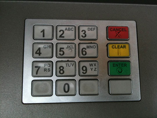
In the case of the safe above, I expected to type in a number and hit the green button to indicate that I was good to go. I based this decision on other interactions in everyday life, for example, taking money out of an ATM where I would enter a 4 digit pin and hit the green button. I did this automatically, without even reading what the buttons said.

I don’t think there’s either of us at fault here, we just interpreted the colour in different ways. The safe manufacturer probably assumed red means secure, where as I thought it meant error and green meant confirm.
Applying colour to web interaction
We can use this technique in our designs too, assigning different colours to different actions.
Using red for delete or cancel actions may make it quicker for your user to make an association with that link. Likewise, green can be associated with an add or save action.
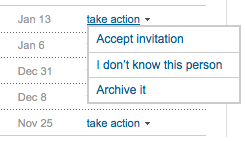
Lets look at LinkedIn for example. Here are the actions associated with someone requesting to be connected to me.

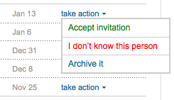
But what if we gave these actions some colour association.

To me this cuts down the amount of time a user has to spend reading the action text. Instead, they are able to visually identify the green link and assume by clicking it will be a confirm action.
What are your thoughts on associating colours with actions and have you any good examples?
Receive more design content like this to your inbox
I promise not to spam you. No more than one email per week.