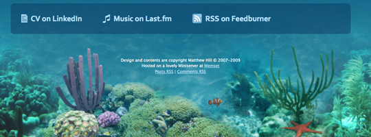
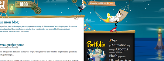
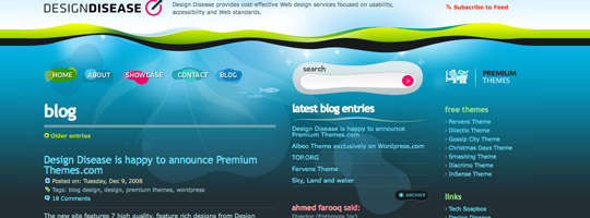
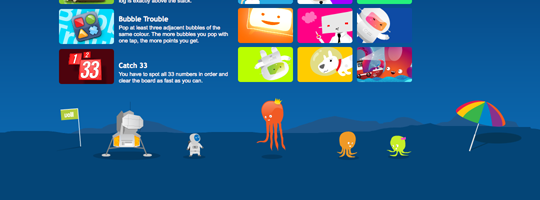
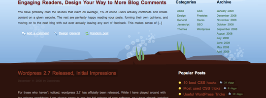
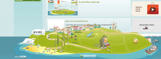
A popular trend over the past year or two is using landscapes, cityscapes and seascapes in a design. Often placed in a website’s footer, they’re a great way to show off your creativity and as a web designer gives you a chance to test out your Illustrator skills.
A few tips for designing your 'scape'
1. Get some stock photography
You can get lots of downloadable vector graphics and photos from iStockphoto.
2. Check out Flickr
Flickr has loads of Creative Commons photos available for use.
3. Take your own photos
Get out around your town/city and take a few photos of noticeable buildings.
4. Sketch your own ideas
Jot down your own hills and buildings on paper.
5. Finally, get tracing and cutting in Illustrator and Photoshop
Now you have your inspiration you can start tracing in illustrator and trying different Photoshop effects on your buildings to come up with the perfect amazing scape.
Check out the showcase below for inspiration from the best.
Showcase of cityscapes
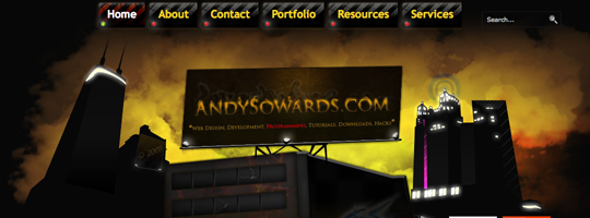
1. Andy Sowards
2. Disability Heroes
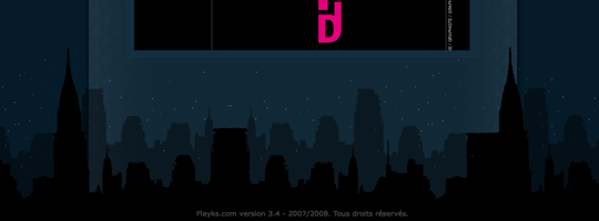
3. Flayks
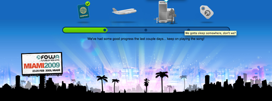
4. Gotta Get To FOWA
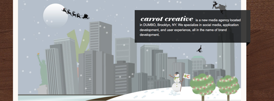
5. Carrot Creative
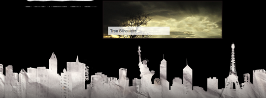
6. Sawyer Hollenshead
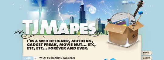
7. TJ Mapes
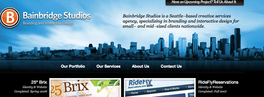
8. Bainbridge Studios
9. NY Moon
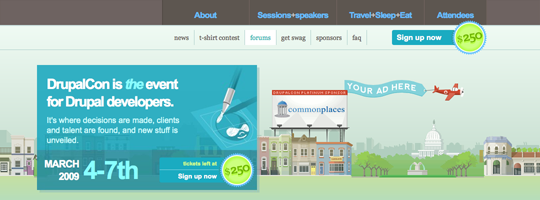
10. DrupalCon
Showcase of landscapes
11. The Mattinator
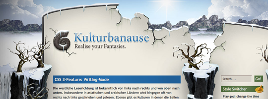
12. Kulturbanause
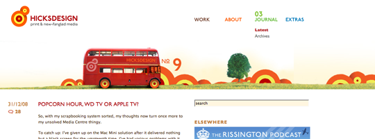
13. Hicks Design
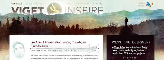
14. Viget Inspire
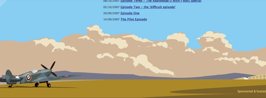
15. Rissington Podcast
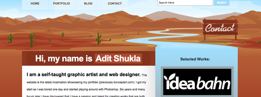
16. Adit Shukla
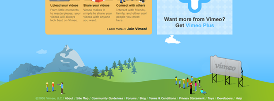
17. Vimeo
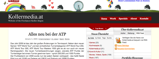
18. Koller Media
19. TwitterFone
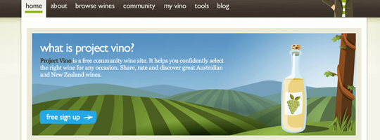
20. Project Vino
Showcase of seascapes
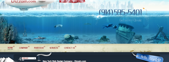
21. Dizzain
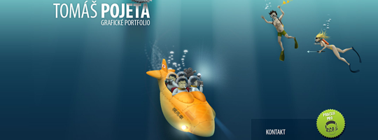
22. Tomas Pojeta
23. We Are Not Freelancers
24. Frisk Design
25. David Torondel
26. Design Disease
27. Volll
28. Get Me Fast
29. Stylized Web
30. DivVoted
Further Reading
Receive more design content like this to your inbox
I promise not to spam you. No more than one email per week.
