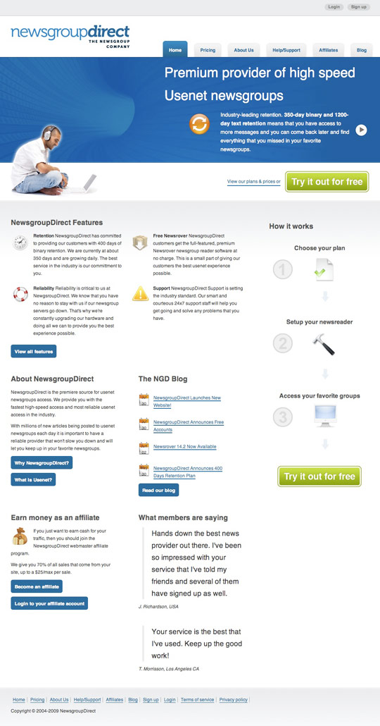
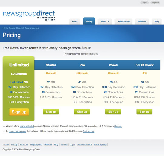
I’ve always found it interesting reading the design process of others (David Airey, Contrast, Brian Hoff). It’s good to have an insight into others work, to see if I can learn anything from their process but also for curiosity. So I’ve put together a break down of my design process, using a recent project as a real life example, Newsgroup Direct.
Overview
I was recently hired by Newsgroup Direct (NGD), a leading Usenet newsgroup service provider, to revamp their website, make it more modern and improve signups.
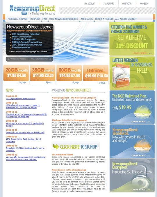
Here is their previous design.
Planning
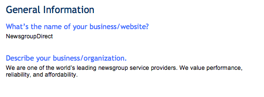
The first thing that happens when I get an enquiry is I send the potential client a website planner. The website planner, a series of questions I have listed in a Word document, will gather requirements for the project.
The key objectives of the planner:
- Find out who the client is and what they do
- Who their target market/user is
- Who their competition is
- What deliverables they want from me
- Timeframe and budget
In a nutshell, NGD require a makeover with a modern & easy to use interface. I am responsible for the XHTML/CSS templates for the main pages (they already have a development team in place for the back-end programming & integration).
Research & Ideas
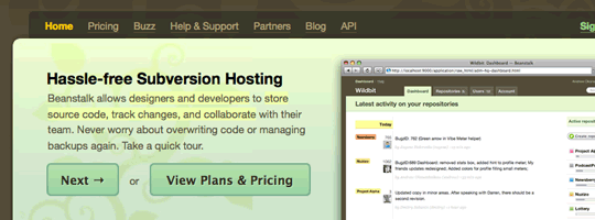
Current site
I start by going through the current website and list things that can be improved.
Various issues raised for NGD include non-semantic markup, no defensive design, markup was invalid, poor Google ranking for keywords, no signup enticement, overload of available sign up options and several usability issues.
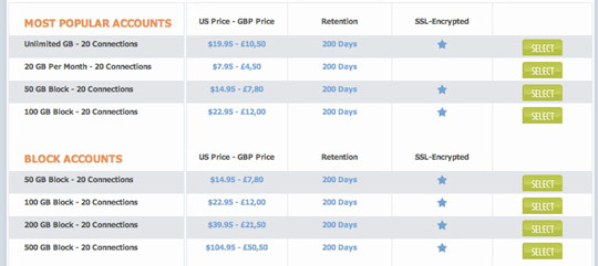
NGD had over 40 packages to choose from, which can be too overwhelming for the average user.
Competitors sites
The next stage is to analyse competitor websites; what is good or bad about them. If I can take on board what is good and eliminate what is bad, then there’s a better chance of coming up with a successful solution.
Ideas
I suggest several improvements that can be made to the current site, showcase various features of other non-related sites that I feel can be integrated into the new site.
Several ideas I have for NGD:
- Clear instructions on how to use NGD and setup newsreaders for novice users
- New logo to reflect new branding
- Narrow down the packages (introduce a free package for trial)
- Clear call to actions
- Highlight the key features of NGD with a slide reel in the header
Logo
Depending on the project new branding may be necessary including logo, stationary, company image and the website.
To help with their new online branding, I recommended NGD have a new logo designed & I suggested a couple of professional logo designers I know or have worked with. They went with Graham Smith, a well respected and well known graphic designer from the UK.
Graham did a great job with the logo and this was the final outcome.

Information Architecture & Sitemap

I should mention here that at each stage I get feedback from the client and discuss it. It’s important to make sure they’re involved the whole way through the process.
For IA I jot down every section of the website on post-its and arrange them (on a wall or fridge) in order of importance. This is an great technique (that I was first introduced to by Front) that allows you to easily change and rearrange your order. In the end you will end up with various levels of importance, which will help with your sitemap and wireframes.
Once I settle on the IA I produce a sitemap. I usually produce the sitemap in Illustrator. The reason I use Illustrator is it allows me to move pages about (unlike using paper) and it also produces a professional outcome that I can pass onto the client, but there are various other tools you can use.
Wireframes
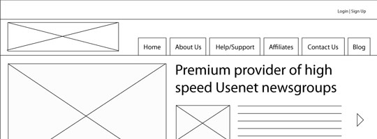
I start by sketching wireframes and then move onto Illustrator to produce more professional looking wireframes that I can pass onto the client and depending on the project I could produce 1, 2 or 3 wireframes.
For NGD I only produced 1 that was the homepage as this is the most important page while I kept the other pages (pricing, info pages etc.) as paper sketches.
Mockups

Once the client is happy with the wireframes it is time to open Photoshop and start with a fresh canvas. The good thing about this process is that I now have a wireframe to build the design over.
Some key things to keep in mind here:
- Branding - tying in with the overall brand, colours, mood
- Target audience - NGD's audience are 20-35yr old males so it has to appeal to them
- Grid - keeping the elements structured and to a grid system is important
- Development - bare in mind this has to be produced in CSS so don't make anything too complicated and keep graphics minimal
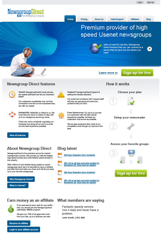
Homepage mockup
Implementation
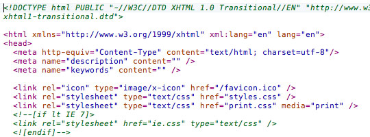
All good to go, the front end development process starts and I produce templates for:
- Homepage
- About Us
- Pricing
- Sign Up
I also produce a template that has various other styled elements that the NGD developers can use if need be, which includes tables, forms, buttons, alerts etc.
Completion
The project is complete and the templates are then passed onto the client (in this case NGD’s development team to integrate into the framework).
After launch I will still monitor the analytics and make suggestions on how to improve the site and conversion rate. It’s hard (or impossible) to get it perfect first time, there are always things you can learn from how the users use the site and make improvements based on this.
What's your process involve?
Insights are always interesting and useful. Even if you’re not a web designer, it’s good to hear how projects develop.
Receive more design content like this to your inbox
I promise not to spam you. No more than one email per week.
