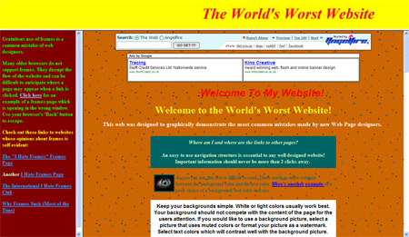
 I was talking to Kyle Boyd recently and we were discussing a website that he was due to revamp. He asked me the question “Guess what they’re using?” and I then rhymed off 10 things that, as web designers, we should try and stay away from. So I thought I’d share the list with you.
1. Frames
We’ve come a long way from the standard frame website. As well as being poor for usability and SEO, they generally look awful too.
2. iFrames
Similar to frames, but these are small embedded frames within the page. If you need something to replicate an iFrame, e.g. a Terms & Conditions box, make use of the overflow:auto declaration in CSS.
3. Tables
If you’re a web designer and you still use HTML tables to layout a page, then you shouldn’t call yourself a web designer. Get yourself a Web Standards/CSS book. Of course using tables to display tabular data is fine.
4. Animated gifs
Really old skool websites used to fire a load of animated gifs on a page (I was one of them 10 years ago when first experimenting with web design). They usually look poor and more than one can mean there’s too much going on. They can still look well though if used tastefully (on occasion).
5. Inline formatting
If you use something like <font size=”12px”> to format the text on your web pages, you’ll have a fun time when the client asks for a slightly larger font (and you’ve got a website with over 1000 pages). Use external CSS files to format your designs and content. One amendment changes all.
6. FrontPage
I used to use FrontPage years ago and I remember it being a really poor environment to work in, that usually added a lot more code to a page than needed. I don’t know if it’s any better now, but in general it still seems to be frowned upon by web designers. Microsoft now has Expression Web, which I haven’t used, but I suspect is much better. I would say Dreamweaver is the industry standard software for web design, but I would recommend learning XHTML from scratch and hand coding.
7. Internet Explorer 6 (or even worse, 5.5)
Non-web designers don’t realise the agro that we go through when we finally get a website looking brand spanking fantastic in one browser (usually Firefox in my case) then we do the inevitable browser test in IE6 and the website is a mess. Remember to check your work in at least Firefox, Safari, IE6, IE7 and Opera. If you’re using Internet Explorer, think about using Firefox instead, or at least make sure you have the latest version of Explorer (7).
8. Pop-up windows
I hate pop-up windows. Pop-up adverts and notices are even worse. If you must insist on a pop-up/fullscreen website, at least offer an alternative link for a normal window or look at Javascript work-a-rounds.
9. New windows
I prefer to have control over how many windows and tabs I have open in my browser, I don’t like the website deciding for me. Using target=”_blank” launches a new window but disrupts the users experience, so try not to use it. I have to admit though that I still use it myself the odd time, if linking to an external website from a clients site (but I’m trying not to).
10. Flash intro pages
This one really depends on your target market and the purpose of the website. If you really want to impress the pants off someone on a one off experience (e.g., a website for a new movie) then you can get away with it. But if you’re looking repeat visits then a flash intro page will most likely turn users away, as it acts like a barrier to the main content (and also poor for SEO). If required, consider including the Flash intro into the homepage of the site, surrounded by the content and navigation, just as Adobe do.
World's Worst Website
I’m not saying you shouldn’t ever use any of these points,but as a general rule of thumb I think it’s safe to say you should try and stay away from most of them.
Oh, and it turned out they had used FrontPage and FrontPage extensions.
If you’ve any other tips, send them through below.
Receive more design content like this to your inbox
I promise not to spam you. No more than one email per week.
