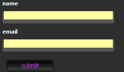
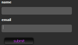
If you have the Google tool bar installed on any of your browsers, I’m sure you’ve come across yellow input fields in forms. This is a feature called autofill that highlights the fields that the tool bar can automatically fill for you. If you’re a web designer, these can be particularly annoying:
- They may not fit in with your site's colour scheme
- User's may get confused into thinking these are the only required fields
- If you're trying to spice up the look of your form, it makes things ugly

Until recently I have always accepted that that was the way it was going to be. I have Google tool bar installed on Firefox. Installed it ages ago and use it occasionally to look up page ranks however, in my opinion it’s pretty useless. With the latest versions of Firefox and Explorer I don’t think you need it, just gets in the way, so I keep it hidden.
I was trying to spruce up a form by adding a background image to input boxes and the fields were turning yellow, as usual, but this time I decided to look up a solution to my problem. Incidentally, you can turn the autofill feature off, but users visiting the site most likely have it turned on. I came across a few Javascript solutions, which I thought would do the trick, until I eventually discovered that there was a simple solution to the problem the whole time. Simply by adding !important after my CSS line, the browser will obey my style rather than the autofill style.
background:#585858 !important;

A simple solution to an annoying problem. My advice is to remove Google tool bar in the first place, but as a web designer it’s handy to know what some of your users might be seeing.
Receive more design content like this to your inbox
I promise not to spam you. No more than one email per week.