A good user experience doesn’t always mean making things easy for users to do.
I was working on a project that involved listing records that users can add, edit and delete.
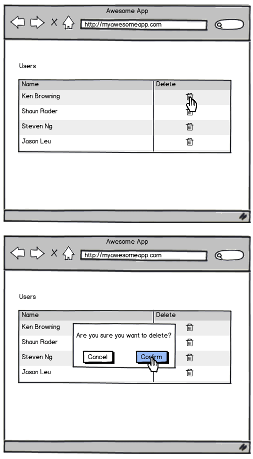
My first iteration included a delete action for each record that when clicked, the user would be asked to confirm if they wanted to delete the record or not. Clicking confirm, or pressing return, would then delete said record.
This is a typical flow for deleting records. It’s often the out-of-the-box technique for some web development frameworks, when you scaffold a Rails project for example.

I presented the prototype to the team and Ken Browning made a good point that users will rarely need to delete records on this screen, and using this flow there’s a chance they may accidentally delete records. It’s relatively easy to click on the delete icon (maybe not knowing what it does) and then press return by accident. Then what are they to do?
Actions that have permanent consequences shouldn't be easy to do
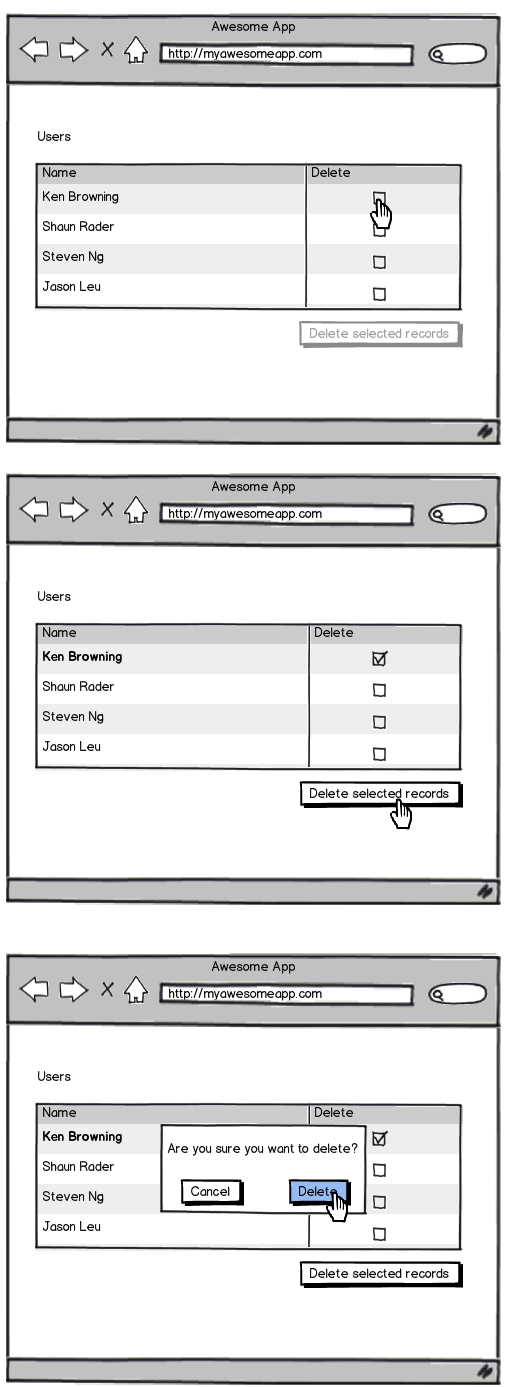
A better technique is one which a lot of web applications like Gmail use.

- User checks the record (or multiple records) they want to delete
- The rows they select are highlighted and the delete button is now active
- The user scrolls to the bottom of the table
- User clicks "Delete selected records"
- User confirms deletion
The 2-click process just became a 1/multi-click, scroll, 2-click process, making deleting a record a lot harder, which is good (in this instance). We safeguard against users making accidental deletions.
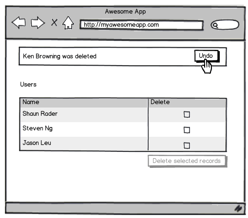
Bonus: Allow the user to undo the action

Allowing users to undo actions adds a bit of development time, but if it’s possible (and especially if you’re working with very important data) it’s a good idea to let users undo their actions.
Receive more design content like this to your inbox
I promise not to spam you. No more than one email per week.