Plotting a customer experience (CX) map is a great technique for getting a holistic view on how customers feel about your product during their life cycle.
Day to day you’re on the front line, face to face with a feature that makes up a very small part of the overall experience. When you’re this close it can be easy to forget what your customers, particularly new users, are actually experiencing.
A CX map gives you a 30,000ft view of the product. This includes every stage and every touch point. Not just the experience of the interface, but experience through all channels; how users come across you on other websites, outside of the web, in person, on the phone, the emails they receive, the copy they read, talking to a sales or support etc.
Creating a CX map is also a great exercise for team collaboration and input. It’s important to know what your team and stakeholders are thinking, where they think there are problems, what’s working and what can be improved. You need to have these people involved so you don’t miss anything and so that they’re invested in UX as well.
How to create a customer experience map for your product
1. Preparation
- Invite all stakeholders
- Have enough stickys and markers for everyone
- Have a meeting room, ideally with a white board or blank wall
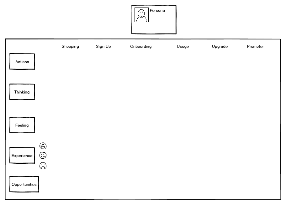
- Plot the map: Different stages of the lifecycle for the x-axis; ‘actions’, ‘thinking’, ‘feeling’, ‘experience’ and ‘opportunities’ for the y-axis
- Choose a persona: For the purpose of the CX map pick a persona that best generalizes your customers and set the context. Depending on how different your personas are you can create a CX map for each later.

2. Run the exercise
As individuals:
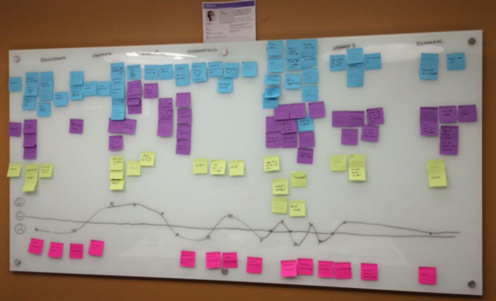
- Write down actions on the stickys and stick up on the board.
- Write down any feelings (emotions) or thoughts (questions) associated with the action or that stage of the lifecycle and stick up on the board.
- Be as granular as you want to be - don’t forget key touch points.
- Use metrics and analytics you’ve previously recorded to support insights.
As a group:
- Look for stickys that are similar and group them together.
- Arrange stickys in order so they tell the story in a linear fashion.
3. Draw an experience timeline
- For each step in the lifecycle, plot whether the user is happy, meh or sad.
- Once you have the smileys plotted join them up to produce a happiness experience curve.
4. Identify opportunities
Now you have a chart, identify the week spots and what you can do to improve them. These are your ‘opportunities’.

5. Use it
It’s all well and good taking part in the exercise but you have to actually put a plan together after and put it into action for it to have been of value.
Prioritize the opportunities, look for any quick wins, do a deeper dive on any of the steps. Each step, or touchpoint, can have its own CX map.
End result and artifact
You’re left with a UX artifact you can use to explore new ideas and help guide your UX roadmap.
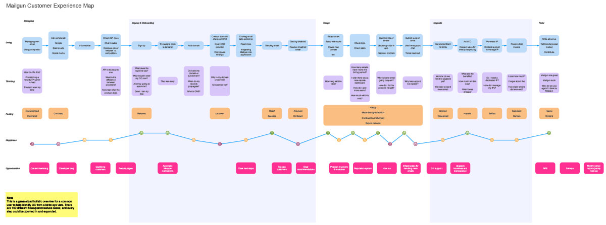
I recently did this with Mailgun. It helped identify some areas that we often take for granted, or areas that I wasn’t aware how big a problem they were. We also identified some quick wins.

Free template for Omnigraffle
Here is a blank template I put together with Omnigraffle. Feel free to download and use it for documenting your CX map.
Receive more design content like this to your inbox
I promise not to spam you. No more than one email per week.