Recently I wrote about user testing content, and how the main results I got from testing was that the copy and content needed to be improved.
Specifically, I was talking about the wording of the copy in applications (web, desktop and mobile).
Here are three ways in which copy can be improved:
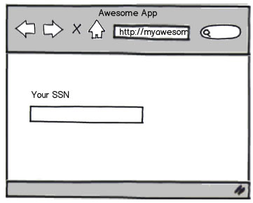
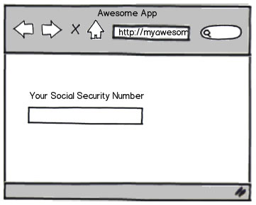
1. Words need changed
In this case, the word(s) didn’t make sense to the user.
I had made a (wrong) assumption that all users knew what certain abbreviations were when some didn’t. Also in some cases the copy was rushed so it just didn’t read very well.
Solution
Change the wording so it makes sense and is understood by all types of users.
Pay attention to grammar and write full words as opposed to abbreviations if there’s any chance a percentage of users won’t understand it.
2. Words need added
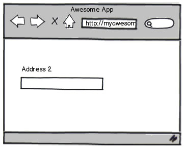
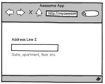
In some cases users would ask “What does this mean?” or “Why do you need this?”. There wasn’t enough information to clarify that.
Solution
Add a word or two to make it abundantly clear what you’re referring to.
Add some microcopy under the input field to help guide the user and help explain why you need this information.
3. Words need removed
My favourite solution, removing words. We tend to waffle, a lot. The more you write the less people will read it.
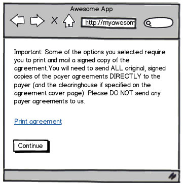
In one particular example, there is a page with a notification that explains to the user that they have to print and sign additional documents. But because there was so much text within this notification area, they simply weren’t reading it.
Solution
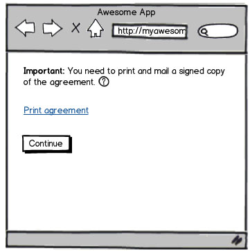
Make copy as short as possible. Always re-read your copy and remove words if you can.
Add tooltips or links to more information for users who may need to read more.
Have you any tips for writing copy?
Receive more design content like this to your inbox
I promise not to spam you. No more than one email per week.