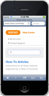
One of the first projects I worked on at Kareo was improving the Help Center.
Support is one of the most important parts of our service. The objective of the Help Center is to help customers as much as we can up front before they have to contact our support team.
How we approached the project
This was a great team effort utilising various expertise within the company.
- Identified problems with the existing Help Center by talking to customers and support.
- User tests on the existing Help Center.
- Looked at metrics behind the existing Help Center to see what pages users were using and looking for.
- Restructured the sitemap, user flows and information architecture.
- Put together a high fidelity prototype and ran customers through user tests to identify key issues.
- Ran a number of usability tests internally and externally.
- Reworded a lot of the copy and content to make it more readable and user friendly.
- Redesigned the UI with a fresh, modern look and feel.
- Marked up the HTML/CSS from scratch making use of SCSS, responsive design, HTML5 and CSS3.
- Better optimized the pages for search and included Google Site Search.
- Made lots of back end changes to help improve performance and user flows.
- Added more tracking for better metrics on how customers use the help center and what they search for so we can continue to iterate.
You can see the new Help Center in action here.
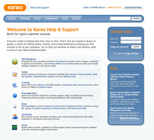
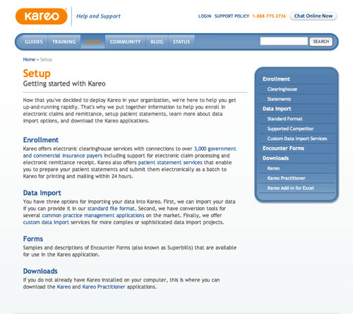
Old Help Center
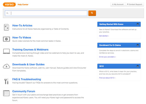
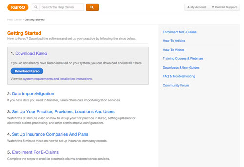
New Help Center
Receive more design content like this to your inbox
I promise not to spam you. No more than one email per week.
