Recruiting and hiring pages typically lack creativity, are filled with lists of requirements and company history information that usually isn’t very exciting.
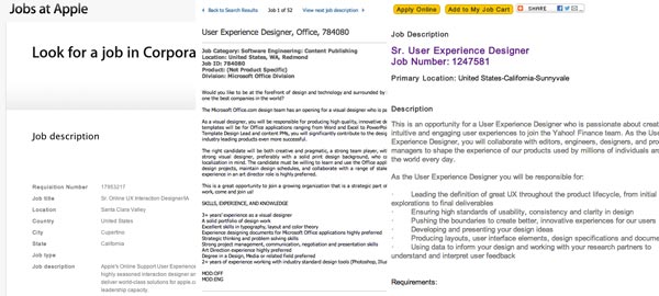
We’re hiring a UX Designer at Kareo and we wanted to make sure that this wasn’t another job listing that no one took notice of.
On top of that, we wanted to showcase that what us designers do on a day to day basis at Kareo is pretty cool. The healthcare industry is an interesting space and one of the advantages of designing healthcare software is that there’s a lot of room for improvement.
So I put this page together to help capture some eyes, and thought I’d share my experience designing it.
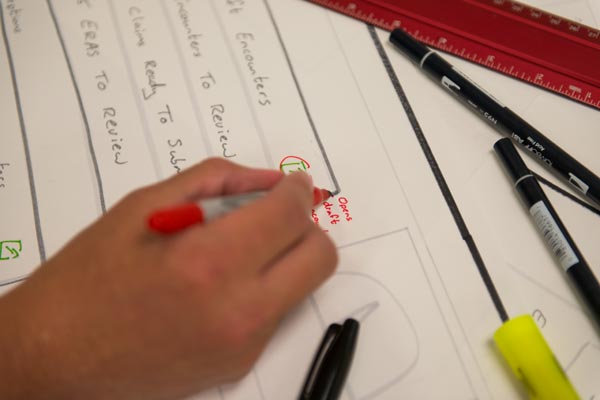
Quality photography
Professional photos of what happens in the workspace is a great way to help people visualise what they’ll be doing, how they’ll be working and who they’ll be working with.
We were lucky to have Josh Gunder on our team who just so happens to be a fantastic photographer, and he helped us take some shots around the office.
Visual themes
For this particular page I used a different visual theme for each section, which takes more time to experiment with than I thought.
Using a combination of Typekit, Kuler, Subtle Patterns, Pictos icons I experimented with different styles to help give the page more character and make it visually appealing.
Parallax effect
This page isn’t over loaded with parallax effects, but has some nice subtleties. I started by using background-position:fixed; which kept the background photos static while the user scrolls.
Then I added some effects using the awesome Scrollarama jQuery plugin that John Polacek put together. It has several scrolling effects you can use, parallax being just one of them.
Using Scrollorama it’s very easy to add an effect to an element.
scrollorama.animate('.iphoneapp',{ delay: 0, duration: 600, property:'left', start:-800, end:0 });Promotion
Of course once the page is ready for action you need to promote it somehow.
Social networks is an obvious start. With the hope that it has some originality friends and followers would help spread the word.
We listed the position on various job boards including Dribbble, Krop and Coroflot.
The finished product
Inspiration
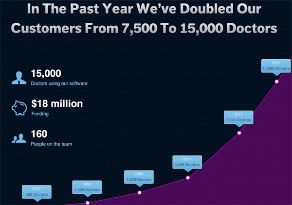
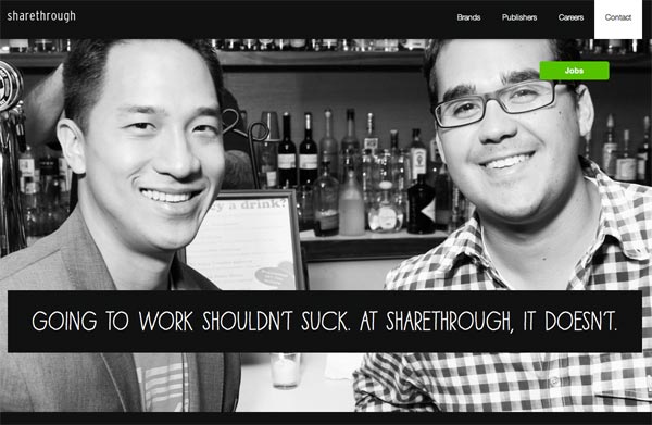
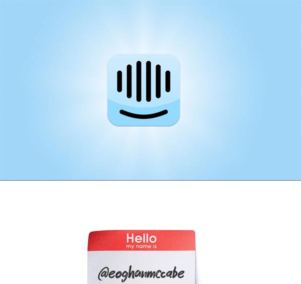
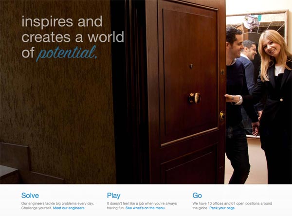
We’re not the first company to put together a creative recruiting page. Here are some others who took the time and effort to do something different.
Receive more design content like this to your inbox
I promise not to spam you. No more than one email per week.

