When you’re designing a form most of you will mark required fields with an asterisk (*). Then you’ll add something like “* Required fields” to the top of the form. But surely we now live in a world where everyone already knows this. Do we really need to include a legend indicating what the asterisk means?
Do we need to explain what it means?
A legend is a key that tells the user what certain symbols or words mean (I’m not talking about the <legend> element here). In most cases a form legend will look something like so:
* Required field
When you design a website there is typically at least one type of form (contact) and possibly many others (sign up, checkout etc.). Sometimes I do include a legend and sometimes I don’t - but do we need to?
What do the big boys do?
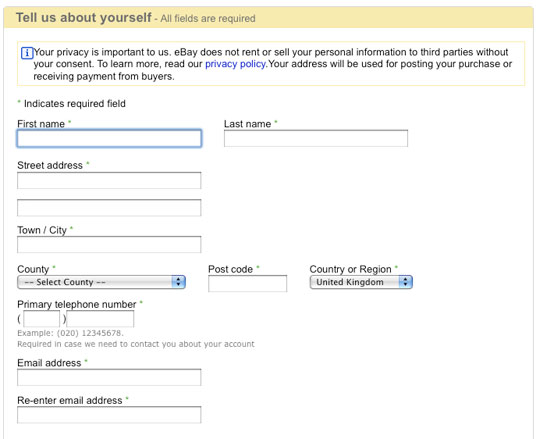
eBay

eBay indicates their required fields with * and includes a legend at the top “* Indicates required field”.
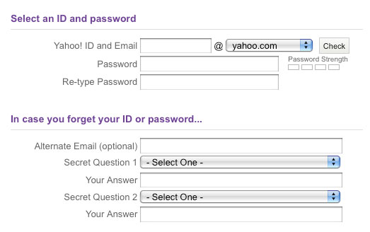
Yahoo

Yahoo puts “(Optional)” beside the only field on their sign up form that is optional (out of 18 fields). This means the form doesn’t get cluttered with asterisks. Good thinking as the label speaks for itself.

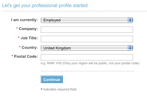
LinkedIn interestingly has a legend at the bottom (below the submit button) indicating what * means, even though all fields are required.
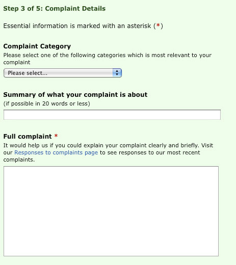
BBC

The BBC complaint form marks required fields with * and includes a legend at the top.
Required fields only
Now you could argue the point that only required information should be asked for on forms. I’m a firm believer in the least amount of fields possible, and particularly for sign up forms this is true. Although for contact forms or checkout forms there will always be information that is optional e.g. web address, address line 2 etc.
It depends
I made the decision not to include a legend on my own contact page. My thoughts here are that:
- Most people using my site will know what the asterisk means
- If someone really doesn't know what it means, they're probably not the type of person I want to work with anyway
Depending on who your website is aimed at, you may or may not have to include a legend. New users or older generation users may not know what the asterisk means, so make the decision based on your target user.
Over to you
This is a very small thing and probably something as web designers we take for granted, but it can make a big difference as generally it involves your conversion page (signups, enquiries) so you don’t want to lose any users.
Similarly to my blog post about signup forms requiring confirmation passwords, I’m interested in your perspective on this.
Do you still need to explain what an asterisk means on a form? Do you use some other method of indicating required fields?
Receive more design content like this to your inbox
I promise not to spam you. No more than one email per week.