This is the third post in a series of things I’ve learned about email, including sending emails and building HTML email templates.
I’ve spent the last few years designing developer tools, 2 of those years having been Design Lead at Mailgun by Rackspace, the email service for developers. Here’s a brain dump of things I’ve learned about responsive email design.
Some mobile email stats
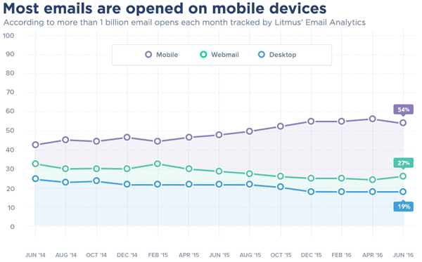
- Email opens on mobile are at 50% and rising. The exact metric depends on what report you check, and what audience you cater for, but I think we can all agree this is important. Source.
-
Gmail has 900m users, 75% of which are on mobile. Source.
-
Email Client Market Share, as of October 2023, has Apple (including iOS, iPad) at 58%.
-
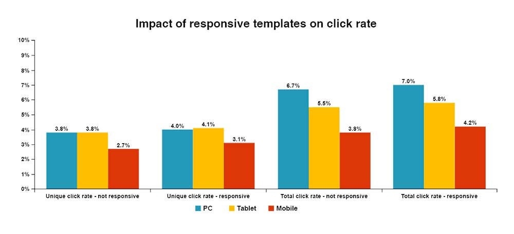
Mailchimp found that unique clicks amongst mobile users for responsive campaigns rose from 2.7% to 3.1% — a nearly 15% increase. Source.
- For every $1 spent, $44.25 is the average return on email marketing investment. 64% of decision-makers read their email via mobile devices. Source.
Responsive design
What is responsive design? Ethan Marcotte coined the phrase “responsive web design” back in 2010.
“By marrying fluid, grid-based layouts and CSS3 media queries, we can create one design, that, well, responds to the shape of the display rendering it.” — Ethan Marcotte
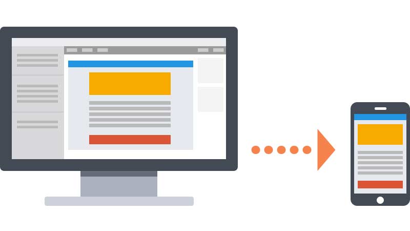
When he wrote his article he was talking about web design. So how does this apply to email? We can still make use of fluid design, grid based layouts and media queries, the problem is not all clients support these. So we need some hacks along the way.
Mobile client support
StyleCampaign provides a great breakdown of media query support in mobile clients.
Mobile clients that DO support media queries
- iOS native
- iOS Outlook
- Android native
Mobile clients that DO NOT support media queries
iOS GmailiOS InboxiOS Yahoo- Android Gmail
- iPhone Yahoo
- Windows
Which means, like everything else in email, we need a bunch of hacks and methods for emails to be truly responsive and bulletproof for mobile.
Update November 2016: Just recently Google announced support for embedded CSS and media queries in Gmail. This is HUGE for the email development industry. Now, as of September 2016, Gmail will support a slew of CSS properties which makes template development a lot easier for Gmail.
Responsive email techniques
You’ll hear various terms being thrown about including fluid, adaptive, responsive, hybrid, spongy and more.
Fluid
The easiest solution is to stick to a single column and make your emails fluid. This means as the viewport shrinks, your content area shrinks, as outlined here by Litmus.
.container {
  max-width: 600px;
  width: 100%;
}
Responsive / Adaptive
Using media queries and breakpoints we can provide alternate styles for different sized viewports. We can also hide or show elements.
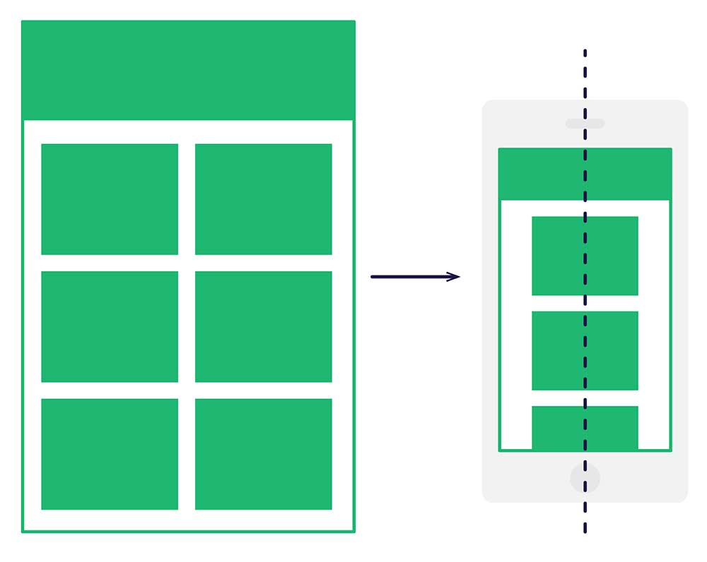
This starts to get complicated once you introduce a grid and columns. I can have a 2 column layout then switch to a stacked 1 column layout below a certain viewport width.
BUT as we seen before, media queries aren’t always supported so this isn’t always reliable.
Hybrid / Spongy
This technique uses a bit of fluid, a bit of responsive, and a couple of hacks for Outlook support. We also ensure the columns stack without media queries.
This technique is outlined by ActionRocket here and Nicole Merlin has written a great step by step tutorial on it here.
Here is an example of the code I use to build most of my responsive emails.
<!--[if (gte mso 9)|(IE)]>
<table align="left" border="0" cellspacing="0" cellpadding="0" width="100%">
  <tr>
    <td align="left" valign="top" width="50%">
    <![endif]-->
      <div class="span-3" style="display: inline-block; Margin-bottom: 40px; vertical-align: top; width: 100%; max-width: 278px;">...</div>
    <!--[if (gte mso 9)|(IE)]>
    </td>
    <td align="left" valign="top" width="50%">
    <![endif]-->
      <div class="span-3" style="display: inline-block; Margin-bottom: 40px; vertical-align: top; width: 100%; max-width: 278px;">...</div>
    <!--[if (gte mso 9)|(IE)]>
    </td>
  </tr>
</table>
<![endif]-->
@media only screen and (max-width: 620px) {
  .span-3 {
    max-width: none !important;
    width: 100% !important;
  }
  .span-3 > table {
    max-width: 100% !important;
    width: 100% !important;
  }
}
Take a look at Fabio Carneiro’s spongy open source repository on GitHub.
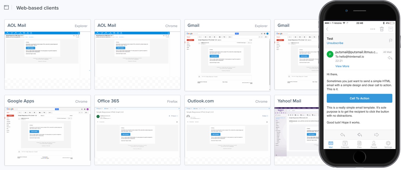
Images in responsive emails
For best results on high resolution screens (like Retina display on the iPhone) you should save any image assets at least 2x the dimensions you plan to display them at.
For example, if you plan to have header image that is 600px x 100px in your email, then that graphic should be saved at 1200px x 200px. Then in your HTML you set the height and width and it looks nice and crisp. Don’t rely on max-width: 100%; styling as Outlook will ignore this.
<img src="logo.png" height="100px" width="600px" alt="Company Logo" style="max-width: 100%;">
Now because we’re dealing with responsive email, we need to make sure this looks good on mobile. So you would have a media query that looks like so. Without this the image would remain at 600px width even when the viewport is smaller.
@media only screen and (max-width: 620px) {
  img {
    height: auto !important;
    max-width: 100% !important;
    width: auto !important;
  }
}
Note that you can make the image quality lower and it will still look good. I wrote about this retina display technique before.
Also a reminder to compress your images. Consider bandwidth and cellular data connections. Optimize for mobile.
Wearables and watches
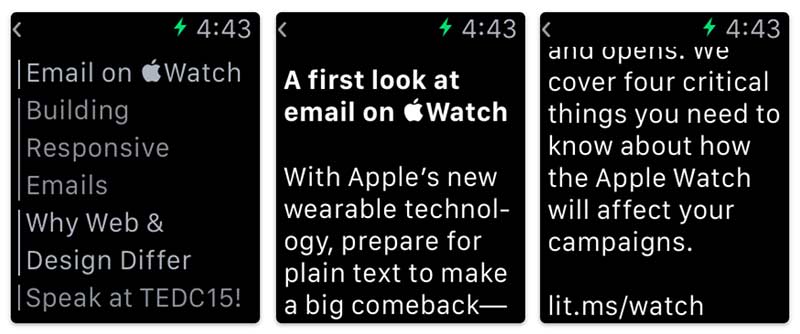
I can’t say I’ve done much email testing on watches but Litmus have this great resource on Apple Watch. Key takeaways:
- There’s a MIME type
text/watch-htmlthat enables you to send an Apple Watch version of your email - Keep it simple and stick to using simple text formatting
Navigation bars in email
My personal recommendation is don’t do it. You’re already dealing with limited space and the user’s limited attention span. Lets not complicate things. I don’t have any stats to back up this opinion, so feel free to present some metrics to prove to me that it is worth it.
Building responsive emails
A list of things to remember when building responsive emails:
- Use !important in your media queries to over power inline CSS
- Apple recommends minimum button height be 44px on mobile devices
- Create your images @2x for retina displays, and remember to set the height and width otherwise they will break Outlook
- Remember to compress those images to reduce the file size
- Keep subject lines fewer than 50 characters
- Preheader text is even more important on mobile
- Minimum font size on mobile should be 13px, recommended is 16px for text and 22px for headings
- Don’t use navigation bars in emails
- Your best bet is to stick with a single column layout, much simpler than supporting multiple columns
- Sure you can use grids it just gets a bit trickier and requires some conditional hacks for Outlook
- Don’t forget your landing pages should be responsive too
- iOS styles links, dates, addresses and phone numbers as underlined blue text, to get around this have a media query class to override
- Use px over ems
- Use Margin not margin (capital “M”) so margins work in Outlook.com
Conclusion
Building HTML email is hard. Building responsive HTML email is even harder. But as we can see from the stats, it is imperative that your emails look good on mobile.
If you don’t have the time, resources or patience then stick to emails that have 1 column and are fluid. It will make life much easier for you. However, if you must have multi-column layouts, then the hybrid / spongy approach is the way to go. Just be aware that ensuring they work on Outlook and mobile Gmail apps makes things complicated.
Here is a simple responsive email template I’ve open sourced for use or if you’re interested in more complicated responsive multi-column layouts check out HTMLemail.io
Receive more design content like this to your inbox
I promise not to spam you. No more than one email per week.