I had the pleasure of attending SXSW Interactive once again this year. As per usual it was flat out. So many talks. So many people. So many parties. So overwhelming.
Most buzzed about apps and startups
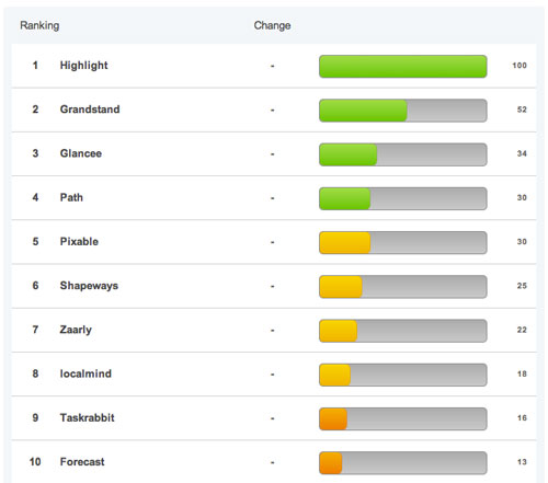
Without a doubt Highlight was the most talked about app, both in the lead up to and at the event.
It notifies you when someone interesting is nearby based on your interests and friends in common.
Mashable has a good leaderboard of hyped up startups.
Notes from talks and panels
It’s hard to get a grasp of all the talks. There’s something like 40 talks all happening at once (somewhere in the region of 1,000 total I’m guessing) so you have to pick and choose, which is a risk as you might end up in something that isn’t what you thought or you’ve heard before.
Some of the more notable talks I attended:
Chris Risdon, Adaptive Path, Applying Behaviour Design
Every design decision we make influences the user.
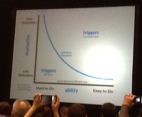
Context is a huge contributor. Think of charitable donations. People are more likely to donate at the counter when they swipe their card, as opposed to you handing them a flier and them going away to do it later. Why? Because it’s easy.
Interesting visual graph with motivation against ability.
David Hogue, Fluid Inc, The Complexity Curve: How to Design for Simplicity
For a product to succeed there are 3 things that must match:
- Mental model, what user expects to do
- Conceptual model, what website asks you to do
- System model, what happens behind the scenes
You can remove complexity from conceptual by hiding it in system e.g. collect the user’s location.
Complexity grows as you get more involved in a project and more people voice their opinion:
- "By the way…"
- "Wouldn't it be cool if…"
- "Looks good but lets add…"
Scope increases or you try to add stuff you’ve seen elsewhere.
How things get complex:
- Don't listen to initial feedback
- By disconnecting action from outcome
- Trying to design your product to be everything to everyone
- Too many "nice to haves"
- Copying other solutions
- Designing to your limitations (rather than ideal)
- Focusing too much on latest trends
- Designing for yourself
- By accepting assumptions
- Not collecting data before you start
Jared Spool, UI Engineering, The Secret Lives of Links
Links use the scent of information to get us what we want.
Walgreens homepage, 4% of it is taken up by what the user wants, 96% is what marketing wants. This violates Fitts’s law. The bigger and closer the easier a target is to hit.
Link copy needs to communicate what users will get when they click.
The back button is the button of doom. Once user clicks back, you’ve lost them and there’s little chance of them progressing further. It’s a predictor of failure.
Three useless phrases:
- Click here
- Learn more
- Click here to learn more
Frog, Prototype vs. Sim: Validating Software & UX Design
User research is often filled with BS, lies, wish lists, advice and complaints.
Use prototypes to validate thinking and ideas.
Make sure development team knows it’s a prototype, that it’s fake and the end result is an artefact (not for production).
Designers have the tools to validate any idea these days.

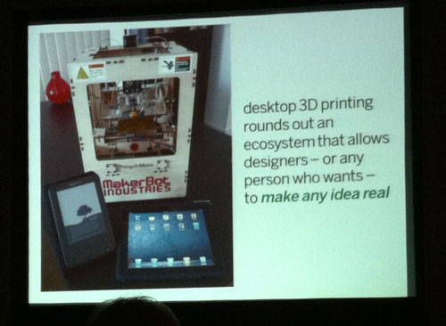
Mark Channon, Author, How to Remember Anything: A Teach Yourself Guide
Break things down into key images to help visualise your memory.
Look around a room and apply visuals to different objects. This acts as a chain of cue cards.
To remember names, look for something interesting about them, listen to their name, apply an image in your head to that name and repeat their name back to them.
Mark Gilbreath, LiquidSpace, Work When Startup Culture Hits Mainstream
70% of the work day desks are empty. Why?
People get work done outside the office, people expect to work where they want to work and technology enables this.
Be economically efficient - spend money on people, not physical assets or buildings.
Let people work outside the office and encourage them to work in co-working environments to maintain that startup culture.
Companies like AOL now have incubators in-house as they try bring that startup culture into the company.
Ogilvy Notes
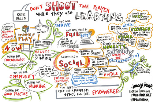
If you’d like to get a quick snapshot view of more of the talks, Ogilvy Notes have some <a href=”“>amazing visuals.
Other things of interest
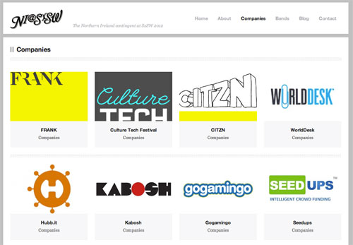
It was good to see the Northern Ireland crew out again. They had some companies showcasing at both the UKTI Showcase and the SXSW Trade Show.
Check out the NI companies and startups that were attending.
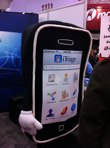
The Trade Show was interesting. There’s a mix of well established companies and new companies handing out all sorts of schwag and dressed in various costumes.
As usual there were a lot of parties. Too many. Official and unofficial, hosted by the likes of Mashable, Zappos, GroupMe, Frog, Media Temple. Notable performers were Jay-Z and Kasabian.
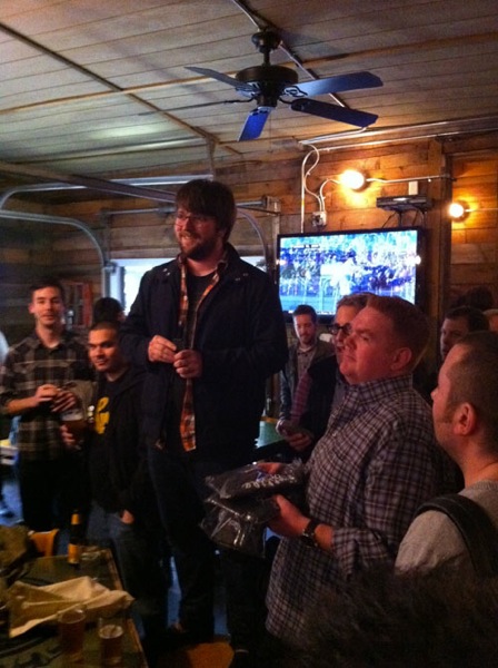
There was also a Dribbble meetup organised by the chaps at Paravel. Great to meet up with other designers and hear what they’re working on.
Conclusion
If you haven’t been to SXSW before, go next year. It’s awesome.
Receive more design content like this to your inbox
I promise not to spam you. No more than one email per week.
