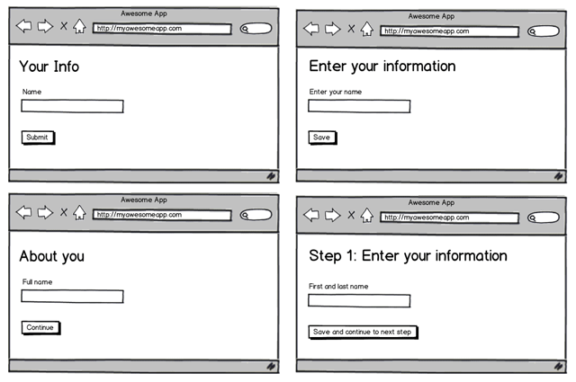
After user testing a prototype of a new product feature (in this case a setup wizard), it took us 2 or 3 tests to determine issues like where a button should be placed, if it was distinctive enough, if the general layout and structure made sense.
That was straight forward, however it took at least another 10-15 tests to determine the wording and copy to be used.
User testing copy and content

Early user testing is an important part of the product design cycle, but it’s important to not just focus on general layout and positioning, but think about the copy and content as well, and not just “figure that out later”.
For web applications this includes:
- Headings
- Instructions
- Labels
- Support text
- Inline help
- Help articles
- Buttons
- Anchor text
- Default input values
- Loading text
Takeaways from user testing copy and content
These were the main issues we found with our copy through user testing:
- The user didn't understand it due to the wording or jargon used
- The user, in general, didn't read instructions on screen and preferred to just click stuff to see what happens
- There was too much to read so the user didn't bother reading it
- Inline help is useful, particularly for first time users, not so much for return/power users
- Users weren't 100% sure what would happen when clicking certain buttons or links
Every couple of tests we would change the copy based on feedback and observations then continue to test. So by the 15th test, there were a lot less issues or questions from the user. That said, there is always room for improvement and we’ll continue to test it and gather feedback.
Copy and content is more important than visual design
As a designer, what often matters most to you is what the user’s reaction is to the UI design; the colours, the textures, the use of subtle insets here and there.
Unless you’re building a product aimed at designers, users rarely care about this. They care about finding or producing content, so the copy that helps them accomplish their goal should be easily and quickly understood.
Don’t leave content or copy until the end. Make sure it gets tested early on along with the rest of your interface so you can iterate and improve it.
What are your biggest takeaways from user testing?
Further reading
- The Language of Interfaces by Des Traynor
Receive more design content like this to your inbox
I promise not to spam you. No more than one email per week.